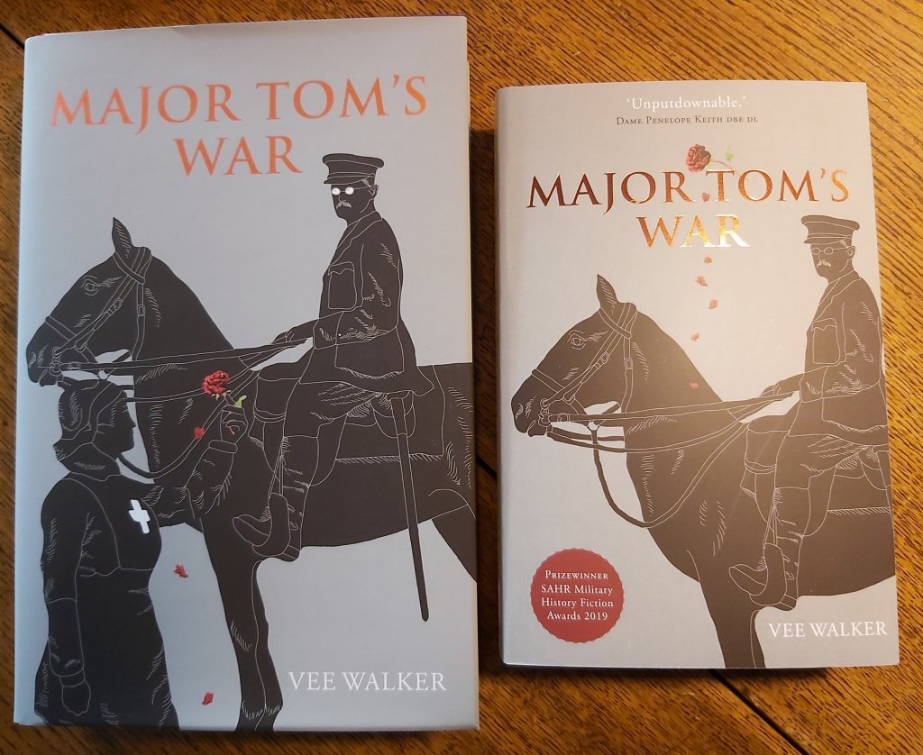
This blog post was inspired by my Canadian cousin Cathy Brydon, who is related to me through my grandmother’s side of the family. After congratulating me on the paperback of Major Tom’s War, she asked, slightly ominously – ‘but – the cover – whatever has happened to Evie?’
What indeed. One minute my beloved grandmother is there on the hardback, clutching a rose, and the next, on the paperback edition, she has vanished.
Cover anxiety is a very real thing!
A cover exists to protect the book within, but should also to communicate the essence of the book to the reader. The original cover’s beautiful artwork is by the Canadian Sikh artist Keerat Kaur (www.keerat-kaur.com). Evie stands tall in her red cross uniform, offering a (highly symbolic) rose to Tom. He gazes down at her through rather spooky white spectacles.
We had a tight launch date for the hardback and the last editorial and cover choices had to be made at a bewildering speed. I remember seeing the final version for the first time at the book launch at the National Army Museum and it being a bit of a shock. The whole process had felt, understandably, rather rushed, and I was jittery (and authors very seldom love their covers at first, apparently).
The process of cover design had however begun months before, with a completely different concept – a bright red background with the silhouette of a horseman emerging from it, face on. It seemed oddly familar and yet I could not work out how. I posted it on the Women In the Arts Scotland Facebook Group and the answer soon came back – it looked (entirely coincidentally) very like the cover of this popular edition of Michael Morpurgo’s fabulous book War Horse.

The WIAS responses were divided in those early days on whether this similarity would be a good thing or not. Some thought the instant gut response – WWI! Cavalry! Man and horse! – was appropriate. I felt, probably a bit arrogantly, that I wanted the cover for Major Tom’s War to be unique, just like the book.
A word here about my extraordinary publishers, Kashi House (www.kashihouse.com). Their creative team had quickly come up with the initial Morpurgo-esque cover based on a photograph they had and some clever computer design. If I had just said yes to it – and I almost did – it would have saved them all time, stress and money. And yet, even though Parmjit Singh and his team were already operating beyond full stretch (setting up for their massively successful London exhibition, Empire of the Sikhs), they politely took on board everything I had said and scrapped the prototype. We started from scratch, and Parmjit commissioned Keerat to produce something far more original and memorable. Not just that, but they also added shiny copper lettering for the title – and a silky dust-jacket. Both hardback, and, now, the paperback, look – and feel – sensational.
As I mentioned above, Keerat’s initial design did not in fact have Evie on it – her figure was added in response to my feedback. Back in 2018 I had been anxious about going with Tom alone – would it alienate my female readers? Would it look like a work of non-fiction?
I have learned a lot about the process of bringing a book into existence over the past two years. I now understand that a book cover’s job is to make you want to pick it up/click on it and ideally take it home/order it, simple as that. We were trying to do a bit too much with the first edition cover – and that was my fault.
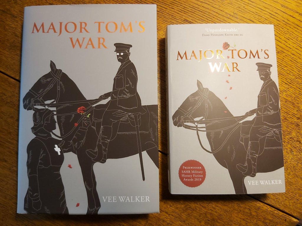
The paperback gave us the perfect chance for a rethink. No-one wanted to start from scratch, thank goodness – the hardback cover had built the foundations for the book’s identity well – but it was clear that shrinking it to fit the paperback would result in some detail being lost and would not work.
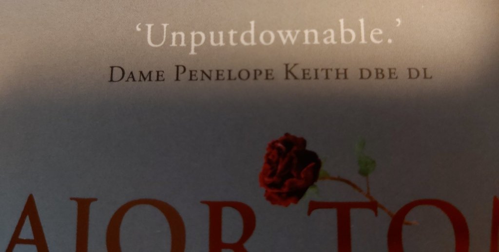
After Major Tom’s War won a prize at the SAHR Military History Fiction Awards, and several other reviewers had Said Nice Things about it, there was also the need to give space to some of those Nice Things Said on the paperback cover. Dame Penelope Keith DBE, DL wrote me a beautiful letter from which we quote just one compelling word on the front – ‘Unputdownable.’ This is also a subliminal suggestion of course – ‘please don’t put it back down – take it to the till instead!
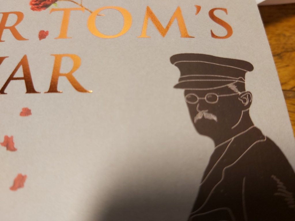
When I realised we would have to lose Evie to make way for the Nice Things Said I thought the rose would have to go too – and that made me sad. As you will know if you have read it, roses crop up as a bit of a leitmotif in Major Tom’s War. The rose is also symbolic of the unlikely tenderness which blossomed between Tom and Evie. Designer Paul Smith (www.paulsmithdesign.com), who gave both editions their classy overall look and feel, cleverly isolated the rose and lifted it to the title above, allowing its petals to fall, and settle, on Daisy’s neck.

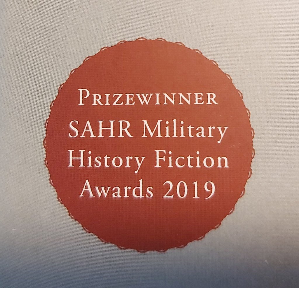
The beautiful SAHR prizewinner’s rosette, bottom left, matches the title colour and catches the eye – but sadly would not do so as much if set against Evie’s dark uniform.
The spooky specs were a bit of a surprise at the book launch and were possibly the result of crossed wires between my desire to make Tom look more human and last-minute discussion with Keerat or Paul. Again views on the specs are divided: Daniel Scott at the book’s distributors, Allison & Busby, said he thought they might draw the eye and so attract sales.
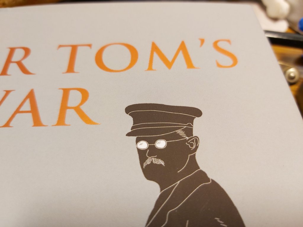
Others thought they were ghostly and offputting, myself included, and so Tom’s specs are less intimidating on the paperback. Who is right? Who knows?
The first paperback I lifted out of its nest of tissue paper (and stroked, crooned over and sniffed – come on, don’t we all with a new baby?) convinced me that the book is now, if not perfect, certainly as I had always imagined it. I think we have taken the right cover decisions – but of course only time – and future sales – will tell.
Enjoy the read – within whichever set of covers you have chosen. And thank you to Parmjit and Keerat and WIAS and Paul and Daniel and everyone else involved in the wild ride thus far 🙏🌹.
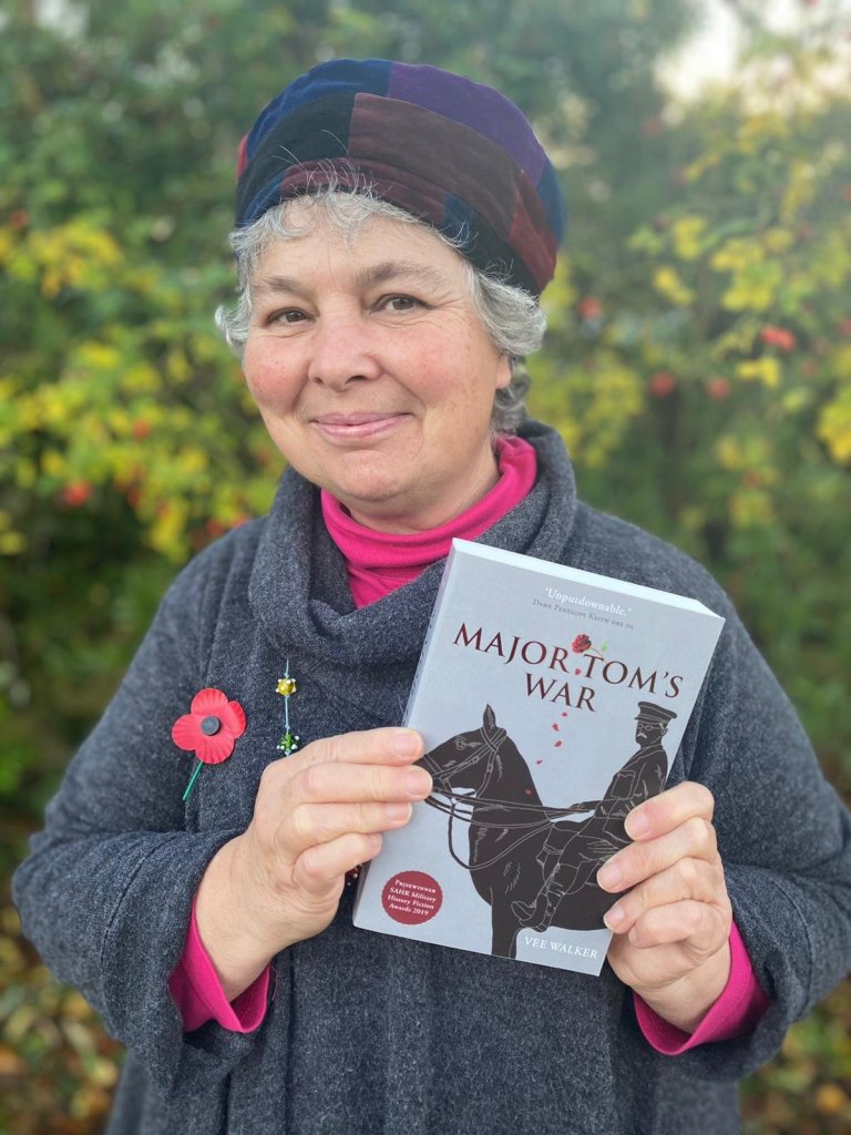
Major Tom’s War by Highland author Vee Walker will be out in paperback via all good booksellers from 19th November priced £9.99. It is already available as an e-reader edition and in hardback.
Vee will be signing advance copies of the paperback at Storehouse of Foulis near Dingwall from 11am to 3pm on Saturday 14 November 2020.