For bigger birthdays, I like to buck the trend, dodging the horrific ‘surprise’ party bullet in favour of a small adventure, often alone, or at least away from my nearest and dearest.
I have worked in Iceland (50), climbed Ben Wyvis (55) and explored Bennachie and the archaeology/history of Aberdeenshire (mid-Lockdown, 60).
This time it turned out to be another island which beckoned.
I was already in Orkney for the magnificent 50th Anniversary St Magnus Festival (well done Alasdair Nicolson and team) but I found I wanted a wilder moment to mark turning 65.
John Cordock of OrcaVentures, skipper of the well-appointed 12-passenger tour vessel Boy Ryan, offers fabulous wildlife cruises (which happen most days, sea conditions permitting) – but – given that we have our own trips to see bottlenose dolphins and often whales here in the coastal waters around the Black Isle, I was hoping for something a wee bit more challenging.
It was then I noticed John was offering a longer trip (though trip is not really the right word for this adventure!) – a longer exploration of the remote island of Swona. It is costly, but this is a riskier, more complicated exercise than the bog standard oh look, a seal of a wildlife tour. Plus a large chunk of the fee goes to support the hard work of the Swona Heritage Group (see link at end), and as I was to discover that is money very well spent. And if sea conditions prevent the trip from happening, then you are refunded in full.
I am so glad I went.
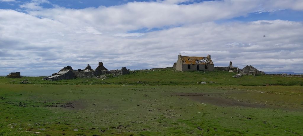
If you have ever taken the Orkney ferry from Gills Bay in Caithness to St Margaret’s Hope in Orkney, you’ll have passed two islands nearer the mainland than the archipeligo en route – Stroma, dotted with houses, which is still farmed – and then wilder Swona, with only scattered buildings, which now has no permanent residents other than its herd of extraordinary wild cattle. These were turned loose when their last owners, siblings James and Violet Rosie, left the island for medical reasons, intending to return but never doing so, thus bringing to an end the era of permanent human habitation on Swona.
I had read about the evolution back to feral of the Swona cattle in Cal Flyn’s remarkable collection of essays Islands of Abandonment (2021) but I never imagined I could travel there to see them for myself.

And I so nearly didn’t. The booking conditions require a signed disclaimer, and (rightly) warn off anyone with mobility issues. If you are prone to tripping or stumbling, this may not be the island for you. Aging is a cruelly insidious process, however, and if I had listened to my own inner demons – it might be too much for you… you’ll be the oldest… the slowest… you’ll spoil it for everyone else – I would have bottled it. I have my daughters to thank for encouraging me, even paying half the cost ❤.
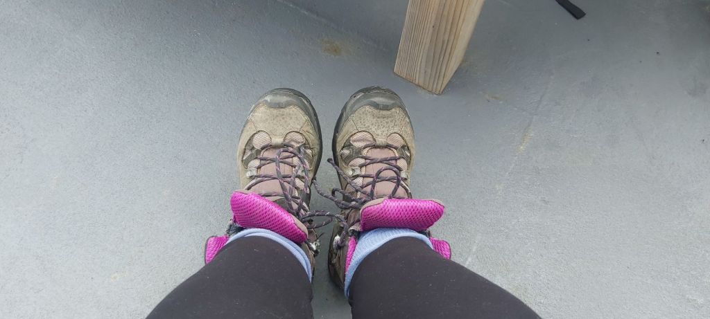
There aren’t many trips to Swona so if you get the chance, grab it! The tides and the weather have to be exactly right. Our midsummer trip left at 13.00 and arrived back about 20.15, so later than scheduled, for reasons I will explain. I wore a dryrobe over jeans and a fleece, then tossed up over wellies or walking boots. The latter won, and I took a thumbstick too, both good calls.

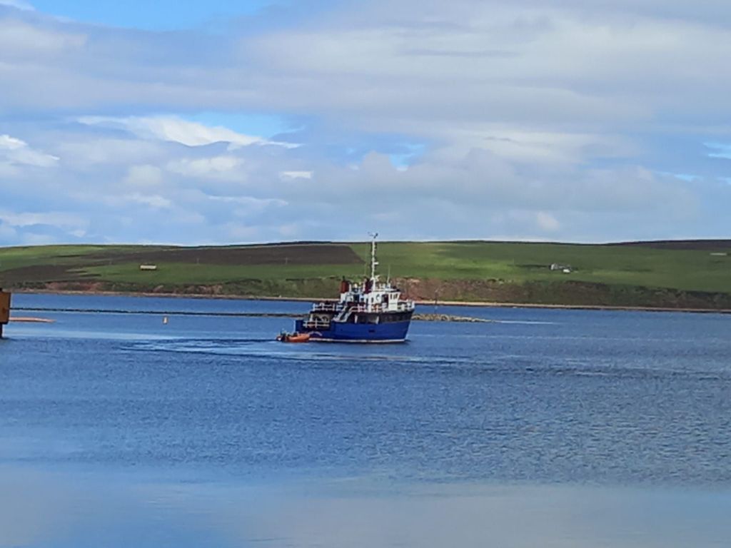
As Boy Ryan bobbed across a remarkably calm and increasingly sunny Pentland Firth (thanks for the pic Eleanor), it became obvious that six of the passengers were Orcadians, several of whom knew each other, and a few of whom had strong connections to the island already. Swona is sometimes known as Orkney’s St Kilda due to its dicey seas, isolation and state of abandonment, so clearly it has a special place in the hearts and minds of local people and is not ‘just for the tourists’. Other than a friendly South African lady (wearing unfortunate footwear about which more later) who was lending John a hand in the onboard catering front, I was the only outsider. I found I felt a wee bit shy, like a new girl in the classroom.
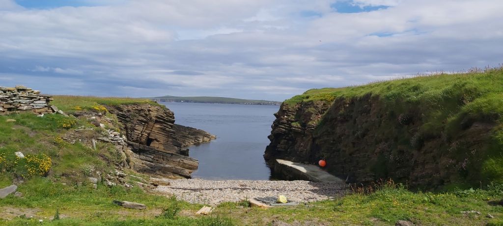
As we approached Swona, John told us there were just two possible places to land a tender on the island (we had been towing a small orange dinghy which was now brought alongside).
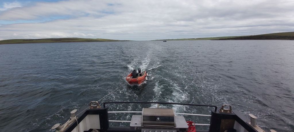
Getting onboard this was quite interesting (an undignified scrabble over shipside rails then a drop into the tender while hanging on to a vertical handrail) but with John keeping me right I managed it fine. We were lucky and landed without incident in the preferred northwest inlet known as The Haven, closest to the greatest concentration of former island homes.
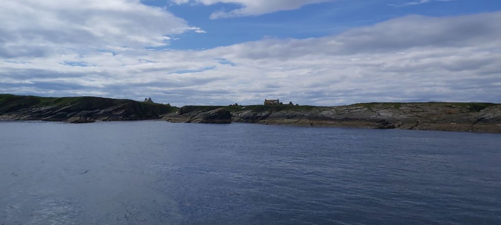
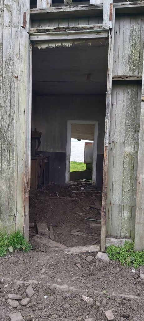
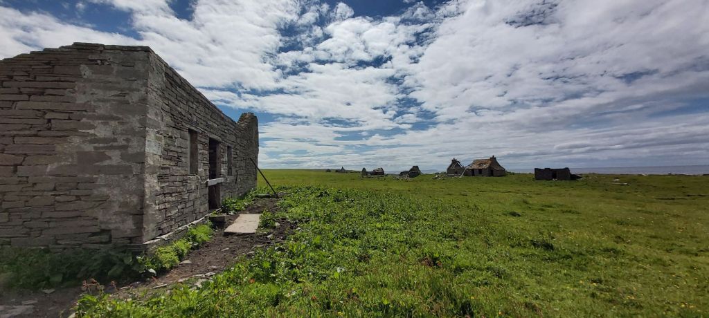
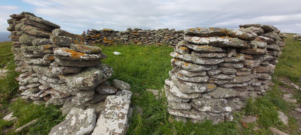
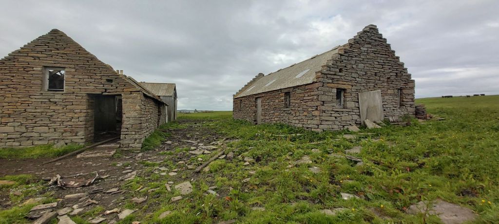
The buildings on Swona are not subsistence-farming blackhoose ruins, they are solid, stolid and often two-storey houses, several still in a reasonable state of repair (with the Heritage Group determined to improve on this). Others are being allowed to become roofless winter shelters for the wild cattle.
Before the collapse of the fishing which sustained its wealth, this was a thriving island community with modern farm machinery and even its own school. Swona folk lived off fishing, farming and anything salvaged from the many shipwrecks around the coast. The northeast part was the most densely inhabited.
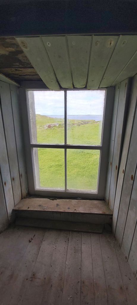
It was really sunny by the time I landed and I was already regretting the hot dryrobe, so Lindsay – retired firefighter, diver, self-confessed Swona addict and our expert guide for the day – allowed some of us to leave surplus kit in Norhead Cottage.
This was in good repair with a surprising amount of timber inside – some bought and brought to Swona no doubt, but some salvaged shipwreck timber too. This is used as a base by visiting specialist groups (Gordonstoun School regularly brings field trips to Swona) so had camp chairs and a lived-in feel, as well as a photograph of the late Queen and Duke of Edinburgh in their glamorous youth, setting the time-stands-still tone of the place.
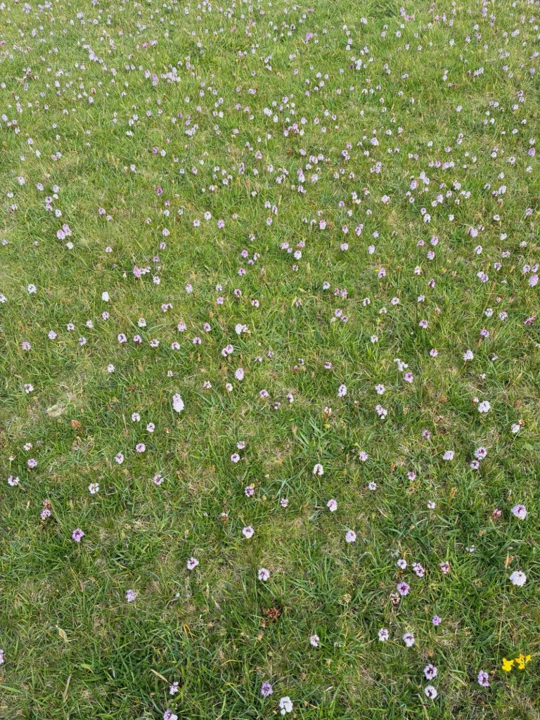
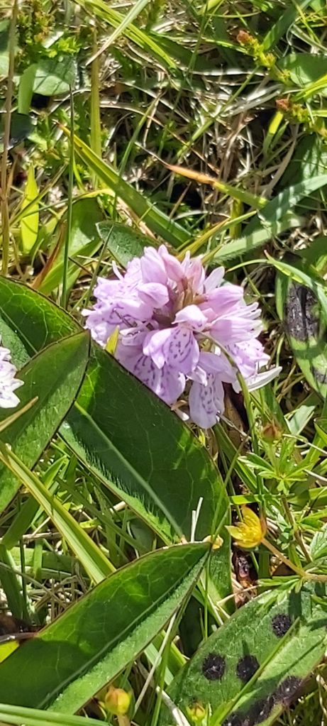
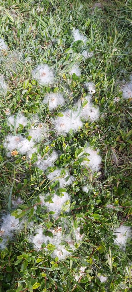
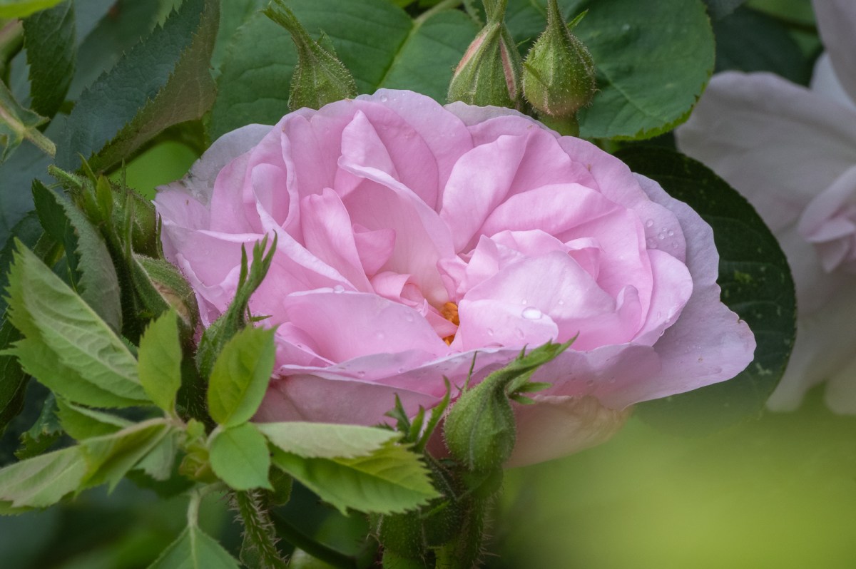
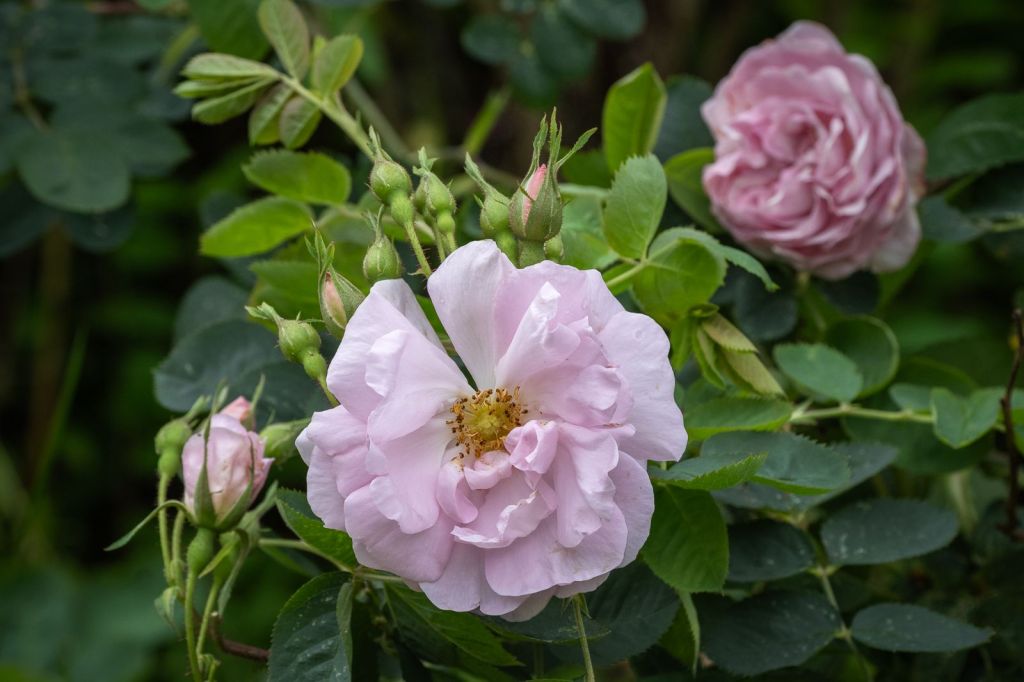
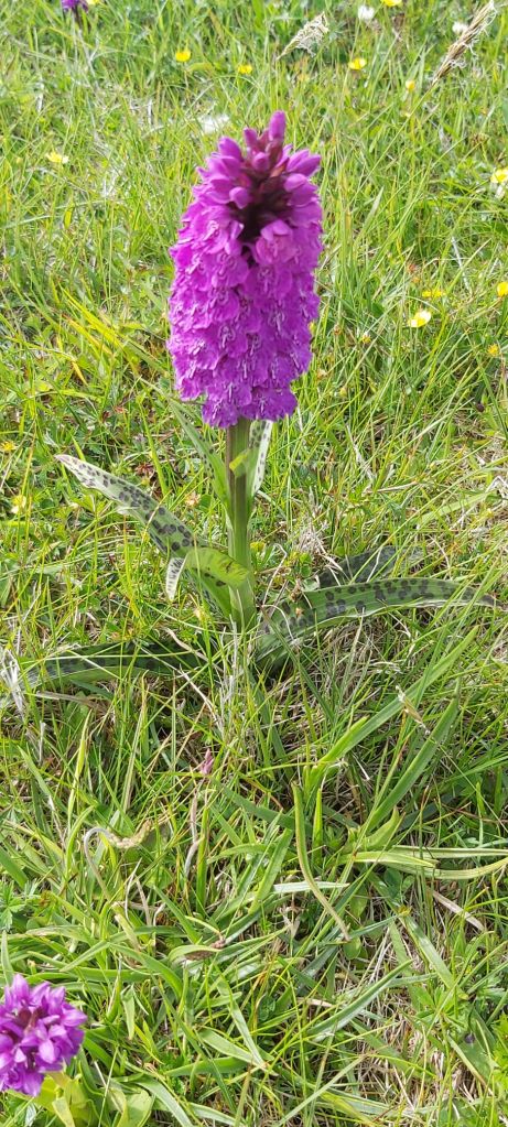
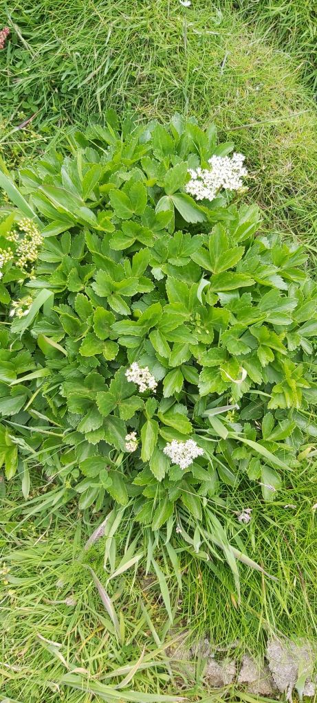
We walked onwards and upwards, Lindsay wisely leading us up the steepest terrain while we were still fresh. Carpets of orchids (mainly northern marsh), ragged robin and cats-ear had me gasping, with here and there a bright blue dab of late vernal squill, a tiny flowering bulb related to our garden scylla. I was able to be useful in tentative identification of most species we found, including the fluffy seeds of creeping willow – a ground-level shrub, if not an actual Swonan tree.
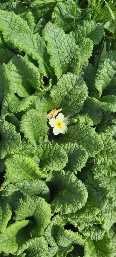
I wondered if a small patch of unexpected primroses found in the cliff edge could be a deliberate planting as they looked so outbof place.
We admired the fearsome gloup, a collapsed sea cave, now a nesting place for shags. I read later that this was also the perfect hiding place for the island’s illicit whisky still.
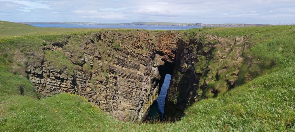
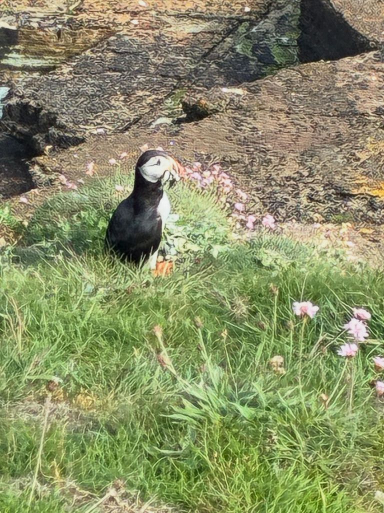
This is more a shelfy/ledgy coastline than a cliffy one but plenty of seabirds were scolding us from nests or roosts in the Caithness flag nooks and crannies, notably puffin, fulmar and shags and we watched seals from the clifftop.
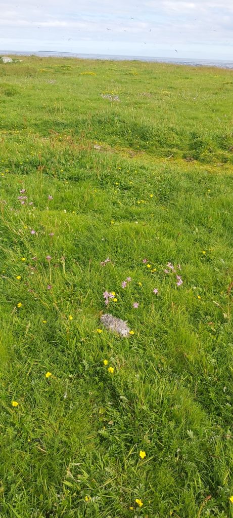
We had to watch our feet (and heads!) as a few late bonxie chicks were huddled into the grassland – we walked on quickly to avoid parental skua indignation. The entirety of the north ‘head’ of Swona is a ternery and wisely put out of bounds in spring/summer as tern chicks are tiny and fragile and their parents understandably fierce in their defence.
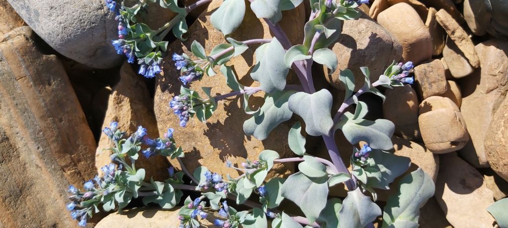
In the south of the island Lindsay led us to an idyllic spot for a snack near carpets of rare blue and grey oysterplant, a plant very dear to my late mother’s heart. I would love to return and paint it.
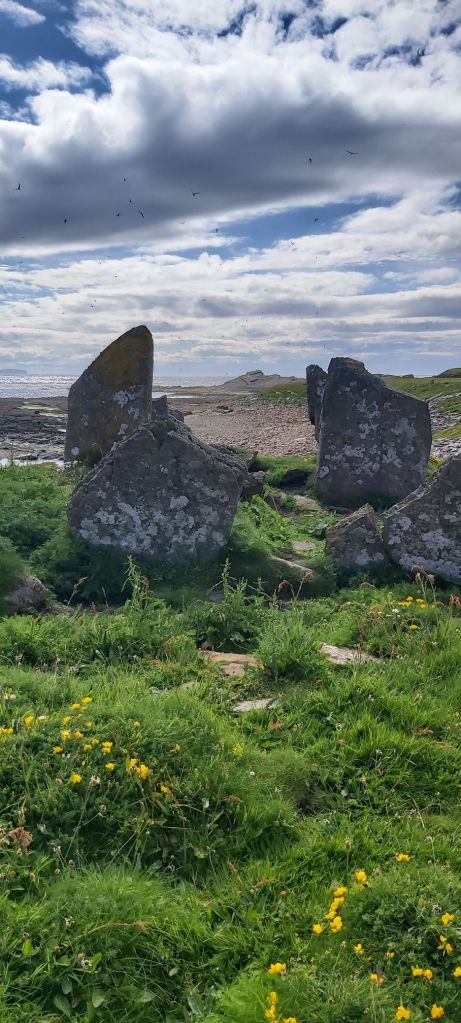
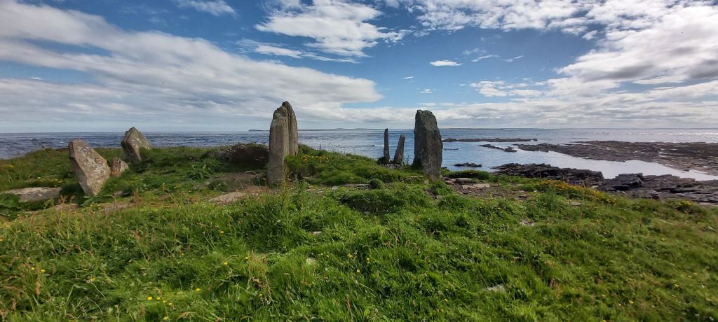
The older archaeological features of the island are concentrated in the south, with the stones of the chambered cairn offering dramatic views. More excavation work is planned here soon.
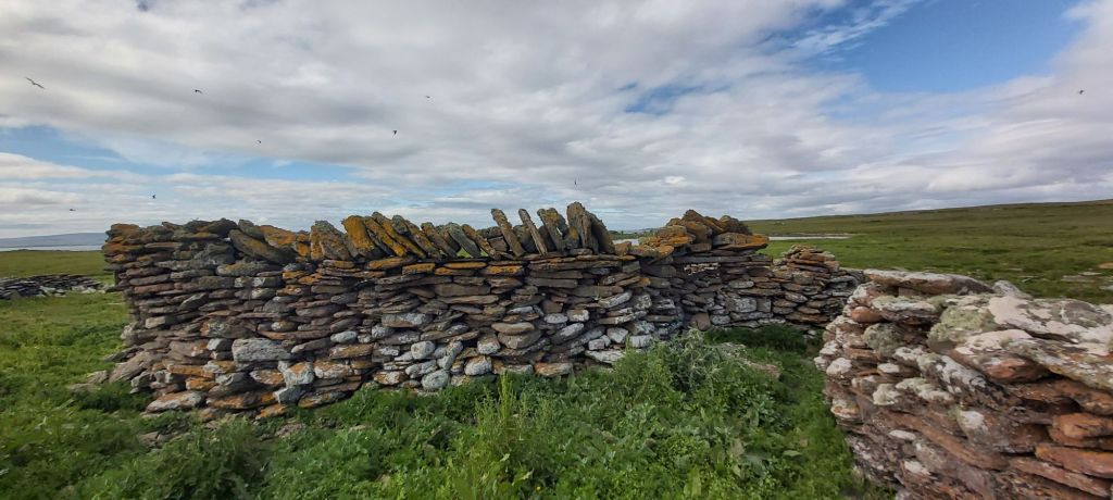
There are also fish-drying sk-yeos, walled enclosures where sea harvests could be air-dried.
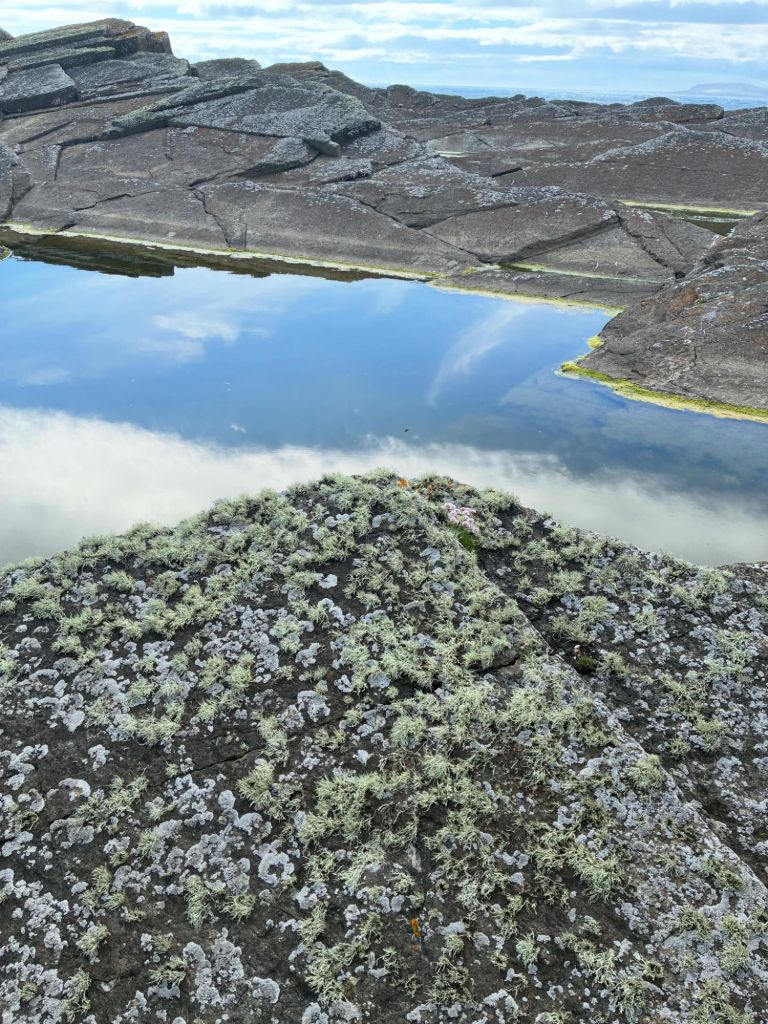
A giant rock pool lured many of our group down to it but no-one was quite brave enough to take a dip, though Lindsay has done so in the past.
The modern lighthouse still keeps vessels clear of this treacherous coastline, fringed with shipwrecks and tragic tales of loss. I read in the late John S. Findlay’s epic Swona Revisited (2014) how one Norwegian vessel came ashore and the only survivor was a big dog, who led the islanders to the wreck. Later the Norwegian ambassador sent an urgent message from the captain’s brother with a description of the captain and an assurance that all repatriation and quarantine costs would be met for the dog, but alas, the animal had already been shot: possibly inconsolable at the loss of its master, and too great a risk to have a non-local dog among free range livestock. Still very sad!
A modern lighthouse shed has been knocked over by the wind like a stack of playing cards.
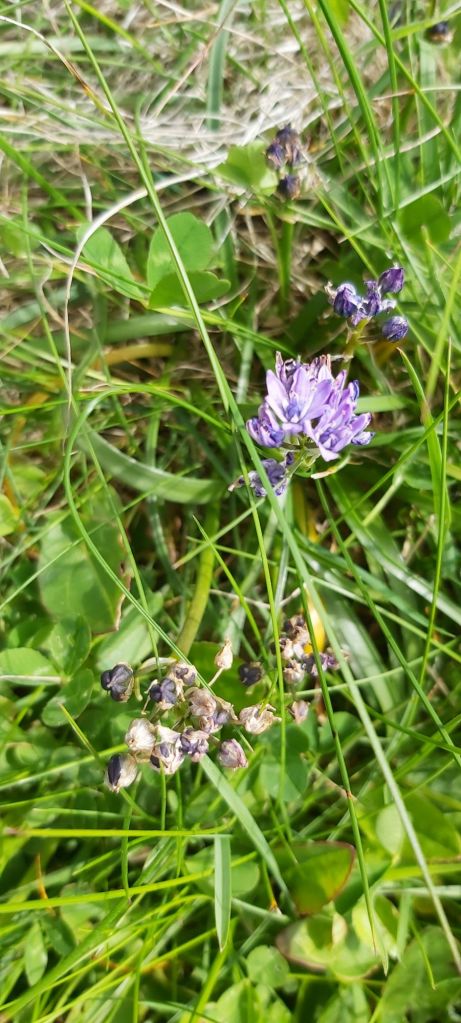
In this area I noticed there were fewer northern marsh orchids and more early purple orchids (unless they are the same and it is simply a strong colour variation – I am no orchid expert?). If the cattle concentrate in this wetter area, their dung will be gradually enriching the soil, so this may explain the variation.
The vegetation around Rose Cottage, the home of the Rosies, showed surviving potato haulmes and stands of.rhubarb, with camomile, Scots lovage and sorrel also present (nice to know the youngsters from Gordonstoun won’t go hungry, providing they can dig and forage!). The Rosie family barns are full of useful flotsam and jetsam found while beachcombing.
The South African lady stepped into a giant cowpat up to her ankles at this point – Swona is no place to explore in slip-on loafers.
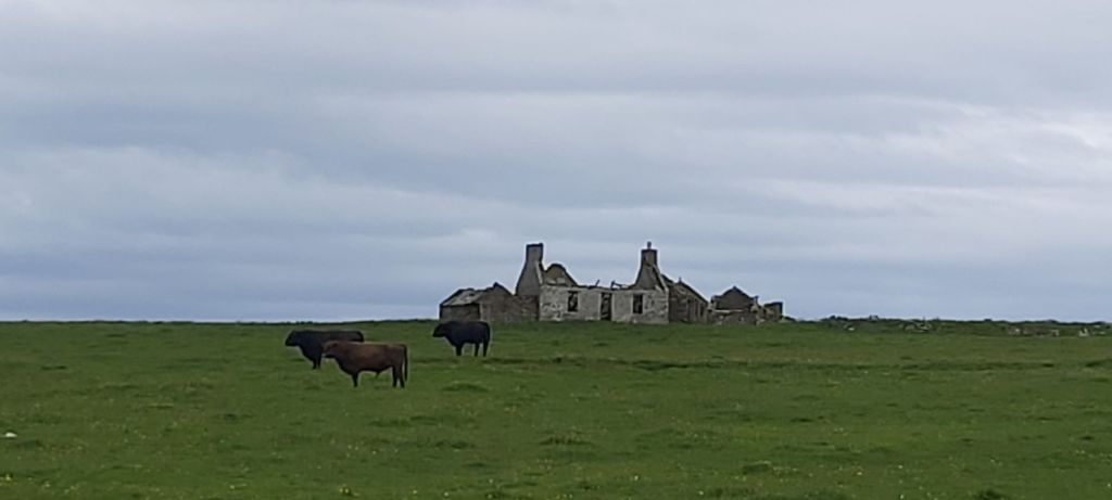
The island cattle were vigilant, not aggressive, and moved as we did, always at a cautious distance. It can be a rather different story if there is a taurine power struggle taking place, as newly-deposed bulls can be feisty and sullen.
Ordinary farmed cattle associate humans with food and tend to approach out of greed or just dull curiosity. Not so these. I counted about 30 in all, maybe 20 cows, 6 calves and four bulls. They watched us closely as we plodded across the flat area known as Dyke End, the hardest walking, as the terrain is dried into rigid ruts made by hooves and these ruts are masked by longer vegetation. I was glad of my stick here.
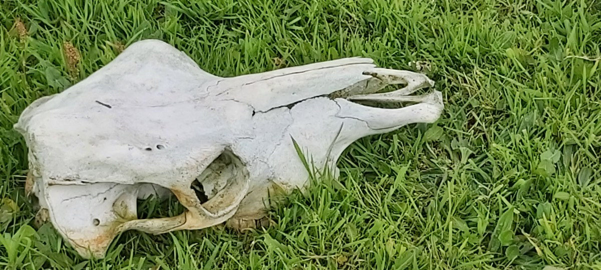
Three deposed bulls – each a former clan chief – watched their former consorts longingly from the periphery of the herd. Here and there, a winter-bleached and wind- and bird-picked skull augured their future. We saw one long dead animal and a healthy-looking calf lying freshly dead in different parts of the island. Why they died will never be known, as this is a truly wild herd (some descriptions of Swona have suggested that a vet keeps an occasional eye on the herd but that is not the case).
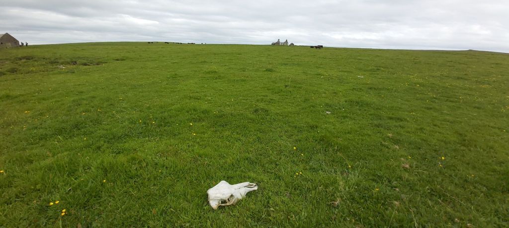
This is not sad, but natural. What is on Swona stays on Swona.
The same goes for the old coastguard/lighthousekeeper records, which seemed in good condition. From a curatorial point of view it would be wise, I think, to make digital photographic copies of everything paper-based on the island for duplication to Orkney Archives, just as a safeguard. This could be done in situ. It is astonishing that anyone should sail as far as the dangerous skerries of Swona in order to steal or vandalise these old homes, but bampots abound, and it has already happened 💔.
All accessible buildings are now kept padlocked as a result.
By the time we got to the school and North-houses, back at The Haven, my legs were wobbly, but I felt cleansed by the air and the exercise and all the wonders I had seen. I had had a very tough spring and felt like I laid down a heavy burden, somehow.
Being on Swona reminds you of what matters in life.
John came back to pick us up, in two groups again, in the wee orange dinghy. I always save the best till last! he grinned and promptly turned the bow not for Boy Ryan but for the cliffs to the south of The Haven. I won’t spoil John’s surprise by telling you where we ended up, but it was an exciting moment at the end of a fabulous day!
John exudes an air of total confidence and is obviously a man happy in his life and work, but when he mentioned a bit of a swell with studied nonchalance I thought oh-oh. This is the Pentland Firth, a place where the tides change, the winds can rise and a whirlpool can appear out of nowhere.
Our first attempt to board was aborted as the swell was slapping the dinghy against the side of the boat. I got soaked as the dryrobe was deemed too hazardous to wear in the tender. Not happy with this, says John, and we pulled away again. A clever manoeuvre then saw us moving parallel with the ship on the opposite side and boarding as both vessels moved through the water. We all scrambled aboard, some of us less elegantly than others, hearts thudding and gleeful. John’s seamanship meant we felt safe the whole time. We sailed for home through rougher seas and a whirlpool.
Thank you again to Lindsay and to John for this wonderful experience.
Timings on all Swona trips are of necessity approximate. On the way back I found I had missed my bus by half an hour, so begged a lift from lovely Ruth (who kindly allowed me to use her orchid and pool and puffin shots for this blog as they were much better than my own) who was also heading for Kirkwall. Thanks to her accelerator pedal made it back in time for almost all the Voces Thules concert in St Magnus Cathedral.
A more-than-just memorable experience. So much more than a boat trip too, a true adventure. Afterwards I was able to identify 21 plant species and send the list over to Lindsay for future fine-tuning and use. Nice to give something back to the island.
If you’re coming to Orkney, do try to go to Swona – but maybe leave those leather loafers at home…
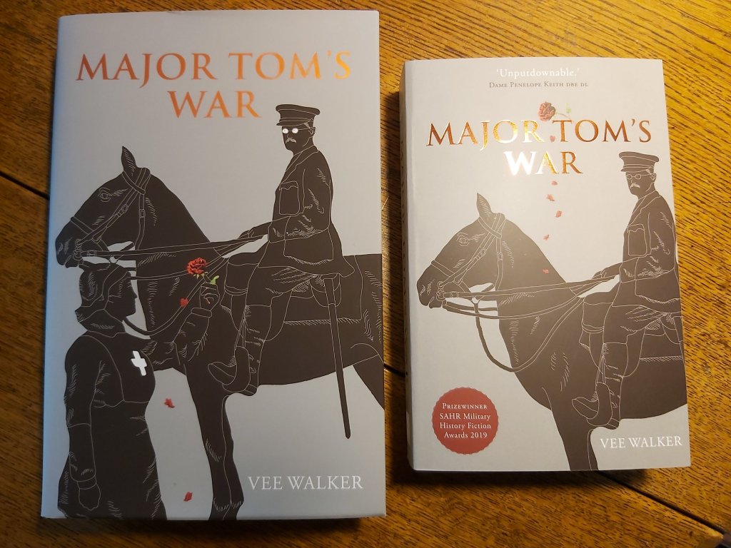
Vee Walker
June 2026
Vee stayed at Feolquoy Farmhouse in Harray 👇
Airbnb https://share.google/0wt82ElQ2m4b2ePNF
Vee travelled with Pentland Ferries 👇
Pentland Ferries https://share.google/15EkVJLl3HFJ63BdF
Book your adventure to Swona with John at OrcaVentures (he does wildlife tours and even seafood cruises with an onboard hot-tub too!) 👇
Orca Ventures https://share.google/nqwuVah5XOQBY2NH7
More on the magnificent work of Swona Heritage Group here 👇
Swona Heritage https://share.google/c6uuMptgZTYkVa0nf